I’m continuing the hidden gems series of the Dynamics 365 v9.0. Today’s topic is about the UI/UX Configuration that is introduced in the Dynamics 365 v9.0. This is not about the “Hub” features that you can use the custom control, that would be a separate topic on the unified client. The configuration options that I’m going to share here is about the refreshed web UI.
Configuration Option #1: Multi-Select Option Set
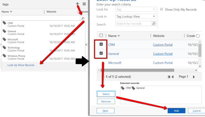
It’s been a long waiting ask from the Dynamics Community to have multi-select option sets. In the past, workarounds for this are either using Many-to-Many relationship or flatten the selection within the entity. With this new enhancement to the platform, we can tailor the UX of the data entry to be simpler. The old workaround using Many-to-Many relationship requires the user to click the (+) button at the subgrid and it will pop-up the lookup window to select (lots of clicks here)
Compared to the new Multi-Select Option Set, where we can capture the data in a single location and less clicks.

Findings on the multi-select option sets:
- Behind the scene, it is stored similar to the regular option set (a pair of value and label), which is good for reporting, it is not stored as just plain text, separated by comma or a specific character that makes it harder to report.
- We are not able to update existing option sets to be multi-select option sets.
Configuration Option #2: Colour-coded Sub Grids
Another UX enhancement that we can apply with the v9.0 is around the Panel header color for Subgrids. In my example, I’m colour-coding case subgrids under account entity to be able to see open cases with the account by glancing the colour coded cases by priority.

The end result is:

Configuration Option #3: Allow Text Wrapping
In the past, it is another common feedback when we are configuring fields on the form, some of the fields are a bit more descriptive than the other. When it’s longer than the pre-defined label width within the section, the text will be truncated. The almost immediate feedback from the end users would be: I want them to be visible!
With the update of v9.0, the Web UI addressed this feedback to a certain degree. There is an option under the System Settings to allow text wrapping in form fields labels and value.

So, I gave it a go and see a long text label for a single-field text. And it wrapped up to a few lines, which addresses the common feedback. yay!

Conclusion
From my perspective, these configuration options to the UI are giving some improvements to the usability and UX aspect of the application. With simple change and minimum effort, as well as doing it in a supported way, we can improve the UX of the system.
HTH!
